Friday, 28 September 2012

Some Work

Portrait of Viv from fancy dress life drawing on Wednesday
A small selection of things that I've done this week, none are particularly good but it's not a bad start. I really need to have more conviction with line and not rely on oil pastels and a chisel posca because although they feel right at the moment, my drawing is not really improving. I really enjoyed the films that we watched in the Thursday "Secret Cinema" drawing session (Virgil Widrich's 'Copy Shop' (2001) was particularly impressive) although I struggled to draw super quickly especially when challenged with a longer and very narrow piece of paper. On Monday I'll have to get photos of the rest of what I've done so far as there's no point in doing the work unless I can easily track what is and isn't working, practicing drawing hands is a biggie for me at the moment, just look at the bottom image and you'll see what I mean.

Drawing from 'The Girl Chewing Gum' directed by John Smith in 1976
Drawing from Viv posing pre-costume on Wednesday

Tuesday, 25 September 2012

Tsunami Appeal at Designers Block Opening


3 of 6 Screen Printed Cards by Benjamin Phillips and Soju Tanaka
Some things that I picked up as part of a 7 for £5 super deal (in addition to the two issues of Okido). I'm struggling to find who the two prints are by but I will have another look soon. I particularly like the above postcards, the contrast in drawing technique works excellently.


Benjamin Phillips Postcard

Soju Tanaka Zine (and business cards)


Rose Blake x Nobrow Small Press


As someone who is both terrified of and despises pigeons, it was nice to see them reduced to silliness in the screen printed (I think) book. Rose Blake is somebody who I constantly find myself going back to, her use of colour and selective detail will never be unappealing to me.

I've been wanting to have a look at this pretty much since it was first released however I couldn't afford to buy it and then it disappear due to it being a limited run of 50 so naturally I was thrilled to find it hidden away in the library, slipped between some anthologies. 

Below are some more pages from the book. Please excuse the darkness of the photos, they were taken just as I woke up this morning.


Sunday, 23 September 2012

Okido/ Rachel Ortas


At the Designers Block opening, there was a stall raising money for the Japan Tsunami appeal. The stall was ridiculously good in that it was selling a wide variety of prints, postcards, back issues of magazines and other things like totes and badges under the offer of £1 per item or £5 for 7. The first thing that I am going to show are two issues of Okido that I picked up within this. I've always wanted to pick this magazine up but soemthing has stopped me, maybe the thought of being a 20 year old "woman" (I say that with a pinch of salt I am very childish) buying a children's magazine has put me off. ANYWAY, seeing as this was such a good deal I couldn't not do it, especially with the prevalence of Rachel Ortas within Okido who has been somebody that I've gone back to again and again with her printed goods; mainly for cards but also with zines which are beautifully crafted and very playful. There are more posts coming up on what I managed to grab from the charity stall so keep your eyes peeled.

Below are two pages from issues 13 and 18.


Friday, 21 September 2012

Wrap #5


Bit of a picture heavy post but I thought I'd share some spreads from the Summer 2012 issue of Wrap that I picked up at the Southbank Centre shop the other day. The basic premise is that it features double sided wrapping paper sheets within the magazine, designed by those who have been featured within the issue. Whilst I've nosed through it before, I've never actually bought it but this time my clammy mitts couldn't resist. Below are some more pictures of the contents. It features some old favourites including Sophie Alda, Charlotte Trounce and Paul Blow with a couple that had slipped past me previously such as cover artist, Katie Scott. It's so encouraging to see young illustrators working on such well formed projects. I fear it'll be difficult not to want to use the wrapping paper as posters but the fear of ruining the magazine is too great.


Liberty 'Harry James Jungle'

I was lucky enough to find an off-cut of this lovely jungle print cotton in amongst all of the more classic florals in the "bargain" bin at Liberty. It's huge! Hopefully I'll be able to make something worthwhile out of it soon. The contrast of the cool blues with the poppy oranges feels so fresh when combined with the quite fine black line of the illustrations.

Liberty always makes me feel nuts, it shouldn't be allowed to house so many ridiculously excellent things. I also picked up a letterpress postcard for my sister's birthday, the quality of the board it's printed on made me weep although I doubt that she'll appreciate that. 

Library #1


Yesterday I took my first trip to the university library. I'm planning on going once every 10 days on top of any course related books that I might need. 

Designers Block

Yesterday evening, Vivien and I were lucky enough to stumble across the opening of Designers Block, part of the London Design Festival situated at the Southbank Centre which just so happens to be one of my favourite places (a close second to Barbican). I'll post a more in depth summary of what happened tomorrow but I thought I'd share this photo that I quickly snapped on my phone just before we squirreled our way inside thanks to a kindly and very generous New Zealander with two spare tickets and excellent cobalt eyeliner.

Monday, 10 September 2012

Self Portrait


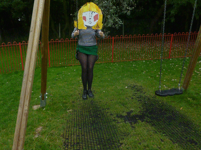
I tried to find some photos where my pants weren't visible but it was a bit difficult.

10 things:
I like snacks
I like wriggly thick graphite
I like naps
I like that my cactus hasn't died yet
I like being rubbish at sports
I like not making any noise
I like being cold
I like cutting my fringe badly
I like packet pants
I like making pointless spreadsheets

I will not miss: 
I will not miss the consistently late number 25 bus
I will not miss the sun waking me up at 5am
I will not miss bumping into people from secondary school
I will not miss the man with the remote control car
I will not miss being told to eat more salad
I will not miss being made to watch Eastenders


Burns/ Clowes/ Seth/ Ware


Via danielclowes.tumblr.com

Sunday, 9 September 2012

Nina Cosford

Museums for Kids Project- Museum of London
Development work for Bloomberg Businessweek Magazine

Jockum Nordstrom

Down The Road, 2009

A Necessary Rest in the Auditorium, 2001

The Drawing Office, 2001


Taken from here
Swedish, uses collage, like boxy buildings- I don't think I could say anymore, I think these were made for me. Definitely looking forward to his exhibition at Camden Arts Centre next summer.


(First three images taken from DavidZwimer.com)

Sunday, 2 September 2012

Nokia Image Makers


I recently found this film made by Nokia featuring two of my favourite newer illustrators- Nina Cosford and Hannah Rowlands. Both are graduates from Kingston. I love that they both have a more naive and playful style, Cosford's being perhaps more traditional where Rowland's feels more defiantly girly. It is this sort of illustrator that I would like to develop into, one who is self aware but isn't afraid to share ideas that might be deemed too feminine. Below are some examples of their work. I think I am going to do a more in-depth post about Nina Cosford because I'm really excited by her work at the moment whereas I've been following Hannah Rowlands for a longer period of time and feel like she's already cemented in my brain.


P.S. It's comforting to know that I have the girls-who-likes-drawing-club hairstyle of a bob with a fringe, maybe it's a coincidence but it makes me feel like I can grow into what I would like to become. That was a bit sick bucket worthy.
Hannah Rowlands, taken from 'Sketchbook' section of her website

Alex Katz

The Blue Umbrella by Alex Katz
This is a pretty rubbishy photobooth picture of my bad photocopy of Alex Katz's 'The Blue Umbrella', which is a painting that I like very much. Katz's painting, specifically his portraits, appeal to me because of the happy nature of his subjects. I also like that the images are not hyper realistic, they convey much more about the individuals' personalities than a piece of photographic quality.

I really wish I could go to St Ives for this. Unfortunately Nottingham is (exactly, I checked) 327 miles away from Tate St Ives, which might explain why me and my sister got so restless during the drives to and from cornish holidays. Maybe I will have to try to somehow get down there before it closes on 23rd September when it is not quite so far away. 

Below is a mini-doc made by Tate, showing Katz's studio. 


Thursday, 23 August 2012

Rose Blake

Artists Only Risograph Print
Finally an Illustrator! Rose Blake is an obvious choice for me- Talking Heads (I'm wearing her t-shirt right now), block colours, Murakami based illustrations, a reason why I chose to apply to Kingston... Clean, bold and well edited imagery that is never boring. She currently runs the excellent Studio Music site which features playlists from all sorts of people, from Luke Best (another obvious favourite) to comedian (and artist) Harry Hill. I really respect the way that Blake works; including things that inspire her within her art as well as being successful on a more commercial level.
Piece featured on rejected works website, thanksbut.com

Tuesday, 21 August 2012

Spots

Nottingham Contemporary Leaflet

I think I like this mainly because it reminds me of my favourite neon orange dot stickers that you can buy in cheap stationers. Another thing it reminds me of is how difficult it is to use a guillotine to trim your work reading for portfolio mounting, something that I was terrible at. Fortunately it didn't have any effect on the success of my university applications. 

Again, please ignore the nails.

It's Nice That Issue 8

'Secret Exoticism' by Tung Walsh, Pages 33-34

'The Scent of Darkness', Photography by Thomas Brown and Creative Direction by Lyndsay Milne, Pages 92-93
Please ignore my more than slightly bad photography and creepy fingers and look at the magazine instead. 'It's Nice That' is a magazine, and website, that has a comprehensive coverage of all aspects of art and design. Whilst the website is great for my favourite past time of killing time on the internet, the magazine goes beyond pretty pictures and interviews. I love that there are different paper styles within the issues since the redesign that took place from the previous issue. It feels very thorough, a different texture of paper can show off different aspects of an image. There were, of course, other pages that I wanted to share however my macbook started wheezing after processing the above two images so I thought it would be best to leave at this. A personal aim is to maybe at some point be featured on the website although I'm not sure I'll ever be of a high enough standard.

A silly thing that makes me feel connected to it is that I once sold an item of clothing to one of the members of It's Nice That via eBay. 

Friday, 17 August 2012

+10years

In 10 years time I'd like to have my own front door and enough full sketchbooks (and mt tape) to sink a battle ship.

Fuchsia Macaree

Fuchsia Macaree's Business Scratch Cards

Illustration post-grad student Fuchsia Macaree recently posted this image of her new business cards on her Tumblr. I can't help but love the scratch card element on the front and her innovative use of including her contact information as competition small-print on the back. Another great thing about the design is that Macaree has used the colour fuchsia in order to permanently lodge her name into your brain, a great excuse to use a bright eye popping pink if ever there was one. 

She also has a series of super A+ travel photo diaries, the Japanese version of which is here.

Tuesday, 14 August 2012

Keita Takahashi


The Katamari games are brilliant, the aim is to eventually roll up everything in the 'Cosmos'. I really admire the level of detail in the game, every item that you can think of has been included; yakult, poker chips, swans, cranes, aeroplanes, town halls, barbeques, the empire state building- literally everything. 

The narrative quality of the game is also interesting, the player, as the Prince or one of his many cousins, is encouraged to roll up items to please the mean King who fires insults at you such as 'Is this on purpose? Like for a documentary or something?' no matter how well you complete the given task. 


I really enjoy the light hearted fun this game encourages as all too often the prime objective of a video game is kill as many people as possible with 'realistic' graphics that don't particularly showcase the imagination of its creators. I think in the right context, design is far more effective if it has a humourous aspect whether it's intelligently witty or just plain silly.