
Showing posts with label Illustration. Show all posts
Showing posts with label Illustration. Show all posts
Saturday, 18 January 2014
Royal Festival Hall
Wednesday, 21 November 2012
Brave New World

Images for 'Brave New World' brief which was our first 'proper' project linked with House of Illustration x Folio Society competition. I'm pretty pleased with how they've turned out although obviously my Photoshop skills are pretty much non-existent. It was nice to be able to draw freely and also to come up with an idea that wasn't such an obvious take on the novel.


Friday, 28 September 2012
Some Work
 |
| Portrait of Viv from fancy dress life drawing on Wednesday |
A small selection of things that I've done this week, none are particularly good but it's not a bad start. I really need to have more conviction with line and not rely on oil pastels and a chisel posca because although they feel right at the moment, my drawing is not really improving. I really enjoyed the films that we watched in the Thursday "Secret Cinema" drawing session (Virgil Widrich's 'Copy Shop' (2001) was particularly impressive) although I struggled to draw super quickly especially when challenged with a longer and very narrow piece of paper. On Monday I'll have to get photos of the rest of what I've done so far as there's no point in doing the work unless I can easily track what is and isn't working, practicing drawing hands is a biggie for me at the moment, just look at the bottom image and you'll see what I mean.
 |
| Drawing from 'The Girl Chewing Gum' directed by John Smith in 1976 |
 |
| Drawing from Viv posing pre-costume on Wednesday |
Tuesday, 25 September 2012
Tsunami Appeal at Designers Block Opening
 |
| 3 of 6 Screen Printed Cards by Benjamin Phillips and Soju Tanaka |
 |
| Benjamin Phillips Postcard |
 |
| Soju Tanaka Zine (and business cards) |


Rose Blake x Nobrow Small Press

As someone who is both terrified of and despises pigeons, it was nice to see them reduced to silliness in the screen printed (I think) book. Rose Blake is somebody who I constantly find myself going back to, her use of colour and selective detail will never be unappealing to me.
I've been wanting to have a look at this pretty much since it was first released however I couldn't afford to buy it and then it disappear due to it being a limited run of 50 so naturally I was thrilled to find it hidden away in the library, slipped between some anthologies.
Below are some more pages from the book. Please excuse the darkness of the photos, they were taken just as I woke up this morning.


Friday, 21 September 2012
Wrap #5

Bit of a picture heavy post but I thought I'd share some spreads from the Summer 2012 issue of Wrap that I picked up at the Southbank Centre shop the other day. The basic premise is that it features double sided wrapping paper sheets within the magazine, designed by those who have been featured within the issue. Whilst I've nosed through it before, I've never actually bought it but this time my clammy mitts couldn't resist. Below are some more pictures of the contents. It features some old favourites including Sophie Alda, Charlotte Trounce and Paul Blow with a couple that had slipped past me previously such as cover artist, Katie Scott. It's so encouraging to see young illustrators working on such well formed projects. I fear it'll be difficult not to want to use the wrapping paper as posters but the fear of ruining the magazine is too great.


Liberty 'Harry James Jungle'

Liberty always makes me feel nuts, it shouldn't be allowed to house so many ridiculously excellent things. I also picked up a letterpress postcard for my sister's birthday, the quality of the board it's printed on made me weep although I doubt that she'll appreciate that.
Sunday, 9 September 2012
Nina Cosford
 |
| Museums for Kids Project- Museum of London |
 |
| Development work for Bloomberg Businessweek Magazine |
Jockum Nordstrom
 |
| Down The Road, 2009 |
 |
| A Necessary Rest in the Auditorium, 2001 |
 |
| The Drawing Office, 2001 |
 |
| Taken from here |
(First three images taken from DavidZwimer.com)
Sunday, 2 September 2012
Nokia Image Makers
I recently found this film made by Nokia featuring two of my favourite newer illustrators- Nina Cosford and Hannah Rowlands. Both are graduates from Kingston. I love that they both have a more naive and playful style, Cosford's being perhaps more traditional where Rowland's feels more defiantly girly. It is this sort of illustrator that I would like to develop into, one who is self aware but isn't afraid to share ideas that might be deemed too feminine. Below are some examples of their work. I think I am going to do a more in-depth post about Nina Cosford because I'm really excited by her work at the moment whereas I've been following Hannah Rowlands for a longer period of time and feel like she's already cemented in my brain.
P.S. It's comforting to know that I have the girls-who-likes-drawing-club hairstyle of a bob with a fringe, maybe it's a coincidence but it makes me feel like I can grow into what I would like to become. That was a bit sick bucket worthy.
 |
| Hannah Rowlands, taken from 'Sketchbook' section of her website |
Thursday, 23 August 2012
Rose Blake
 |
| Artists Only Risograph Print |
 |
| Piece featured on rejected works website, thanksbut.com |
Friday, 17 August 2012
Fuchsia Macaree
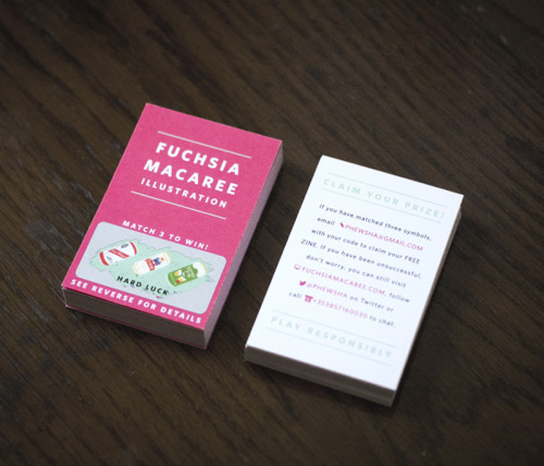 |
| Fuchsia Macaree's Business Scratch Cards |
Illustration post-grad student Fuchsia Macaree recently posted this image of her new business cards on her Tumblr. I can't help but love the scratch card element on the front and her innovative use of including her contact information as competition small-print on the back. Another great thing about the design is that Macaree has used the colour fuchsia in order to permanently lodge her name into your brain, a great excuse to use a bright eye popping pink if ever there was one.
She also has a series of super A+ travel photo diaries, the Japanese version of which is here.
Tuesday, 14 August 2012
Keita Takahashi
The Katamari games are brilliant, the aim is to eventually roll up everything in the 'Cosmos'. I really admire the level of detail in the game, every item that you can think of has been included; yakult, poker chips, swans, cranes, aeroplanes, town halls, barbeques, the empire state building- literally everything.
The narrative quality of the game is also interesting, the player, as the Prince or one of his many cousins, is encouraged to roll up items to please the mean King who fires insults at you such as 'Is this on purpose? Like for a documentary or something?' no matter how well you complete the given task.
I really enjoy the light hearted fun this game encourages as all too often the prime objective of a video game is kill as many people as possible with 'realistic' graphics that don't particularly showcase the imagination of its creators. I think in the right context, design is far more effective if it has a humourous aspect whether it's intelligently witty or just plain silly.
Saturday, 11 August 2012
Foundation
 |
| Taken from my Flickr |
I worked on a comic strip initially around the idea of an eccentric older lady, eventually settling on depicting the story of Ann Timson, 'Super Gran'. For the most part I struggled with what I was doing which resulted in me producing something that wasn't as good as I feel it could have been however I am pretty pleased with how it turned out given this confusion.
Working with collage was something that was enjoyable for me. In particular the challenge of making it look unlike other collage works that're popular at the moment.
Subscribe to:
Posts (Atom)