Thursday 23 August 2012

Rose Blake

Artists Only Risograph Print
Finally an Illustrator! Rose Blake is an obvious choice for me- Talking Heads (I'm wearing her t-shirt right now), block colours, Murakami based illustrations, a reason why I chose to apply to Kingston... Clean, bold and well edited imagery that is never boring. She currently runs the excellent Studio Music site which features playlists from all sorts of people, from Luke Best (another obvious favourite) to comedian (and artist) Harry Hill. I really respect the way that Blake works; including things that inspire her within her art as well as being successful on a more commercial level.
Piece featured on rejected works website, thanksbut.com

Tuesday 21 August 2012

Spots

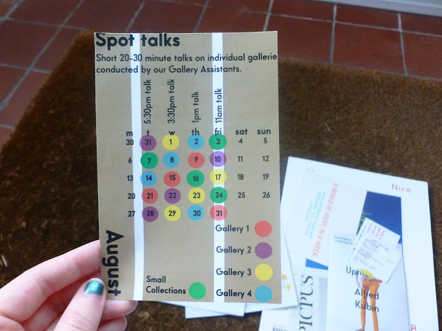
Nottingham Contemporary Leaflet

I think I like this mainly because it reminds me of my favourite neon orange dot stickers that you can buy in cheap stationers. Another thing it reminds me of is how difficult it is to use a guillotine to trim your work reading for portfolio mounting, something that I was terrible at. Fortunately it didn't have any effect on the success of my university applications. 

Again, please ignore the nails.

It's Nice That Issue 8

'Secret Exoticism' by Tung Walsh, Pages 33-34

'The Scent of Darkness', Photography by Thomas Brown and Creative Direction by Lyndsay Milne, Pages 92-93
Please ignore my more than slightly bad photography and creepy fingers and look at the magazine instead. 'It's Nice That' is a magazine, and website, that has a comprehensive coverage of all aspects of art and design. Whilst the website is great for my favourite past time of killing time on the internet, the magazine goes beyond pretty pictures and interviews. I love that there are different paper styles within the issues since the redesign that took place from the previous issue. It feels very thorough, a different texture of paper can show off different aspects of an image. There were, of course, other pages that I wanted to share however my macbook started wheezing after processing the above two images so I thought it would be best to leave at this. A personal aim is to maybe at some point be featured on the website although I'm not sure I'll ever be of a high enough standard.

A silly thing that makes me feel connected to it is that I once sold an item of clothing to one of the members of It's Nice That via eBay. 

Friday 17 August 2012

+10years

In 10 years time I'd like to have my own front door and enough full sketchbooks (and mt tape) to sink a battle ship.

Fuchsia Macaree

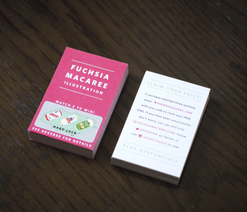
Fuchsia Macaree's Business Scratch Cards

Illustration post-grad student Fuchsia Macaree recently posted this image of her new business cards on her Tumblr. I can't help but love the scratch card element on the front and her innovative use of including her contact information as competition small-print on the back. Another great thing about the design is that Macaree has used the colour fuchsia in order to permanently lodge her name into your brain, a great excuse to use a bright eye popping pink if ever there was one. 

She also has a series of super A+ travel photo diaries, the Japanese version of which is here.

Tuesday 14 August 2012

Keita Takahashi


The Katamari games are brilliant, the aim is to eventually roll up everything in the 'Cosmos'. I really admire the level of detail in the game, every item that you can think of has been included; yakult, poker chips, swans, cranes, aeroplanes, town halls, barbeques, the empire state building- literally everything. 

The narrative quality of the game is also interesting, the player, as the Prince or one of his many cousins, is encouraged to roll up items to please the mean King who fires insults at you such as 'Is this on purpose? Like for a documentary or something?' no matter how well you complete the given task. 


I really enjoy the light hearted fun this game encourages as all too often the prime objective of a video game is kill as many people as possible with 'realistic' graphics that don't particularly showcase the imagination of its creators. I think in the right context, design is far more effective if it has a humourous aspect whether it's intelligently witty or just plain silly.

Saturday 11 August 2012

Near Euston


Both taken by me on a Pentax K1000
This is a hotel sort of near Euston station but I have no clue what it's called or who the architects were. I really like the stacked geometric shapes used in brutalist and modernist architecture, especially when placed in an environment which also  has other, more classically attractive (georgian etc) building styles. 

Another reason why I like this style of architecture is the materials used; concrete, glass, brick. None of these materials are concealed and all are overtly man-made. Each is fit for its purpose.

*Now know it's The Imperial Hotel on Russell Square

Foundation


Taken from my Flickr
I thought maybe it'd be good to put up my FMP work, whilst I'm not completely happy with the final outcome (I was a tad bit lazy in the middle of final major project) it'll be interesting to see how my style changes and progresses over the next few years. 

I worked on a comic strip initially around the idea of an eccentric older lady, eventually settling on depicting the story of Ann Timson, 'Super Gran'. For the most part I struggled with what I was doing which resulted in me producing something that wasn't as good as I feel it could have been however I am pretty pleased with how it turned out given this confusion. 


Working with collage was something that was enjoyable for me. In particular the challenge of making it look unlike other collage works that're popular at the moment. 

Friday 10 August 2012

Gil Inoue

Gil Inoue: David Byrne via It's Nice That

Sarah Parker

Sarah Parker/Catherine Losing: Totally Tropical via It's Nice That
There is a dog barking and a fly trapped behind some vertical blinds, it is ~18ºC.


Hello

Follow my blog with Bloglovin 'This is a blog that I am not allowed to delete'

I like white based bright colours, mechanical pencils, graph paper, crisps,  hairy legs and mangoes.